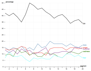
As an example, taking Stephen Harper's 2012 Throne Speech, cutting it into 20 pieces, and plotting several emotions. Bad news (i.e. austerity) bookended between joy, hope.
By Ian Milligan
Was the past a happy place? Could we take a large array of information and learn whether there was an emotional content to it? I’ve been increasingly curious about how we can apply a host of tools that data miners are using on contemporary information to large repositories of historical information: could we learn something new from a distant emotional reading of the past? In this post, let’s briefly chat about sentiment analysis, or the extraction of the overall emotional state of an author. It’s all very new and introductory, but I hope to pique your interest and explore some of these ideas myself.
Do you love your MacBook? What about your coffee maker, or printer, or car? Let’s zoom out. Do people generally have an emotional attachment to Apple? Or Air Canada? What about Ford? This is critical information to today’s marketers. We can now go onto Yelp, Tripadvisor, Amazon.ca, etc. and leave our impressions of a product. For a marketing agency to go through each review manually would take a lot of time and money. While a human being is still obviously the best arbitrer of emotional context, relatively recent work has given rise to automated solutions: sentiment analysis, drawing on the larger body of research known as natural language processing. Next time you review a product, think about how a program would take it, rip it apart into pieces, and try to figure out whether you really loved that printer (or loved to hate it).
What if we took this algorithm, however, and applied it to the past. Could we learn something about the overall emotional tenor of a source base?
The environment I’m currently playing with is the Software Environment for the Advancement of Scholarly Research (SEASR)’s MEANDRE workbench (on my own blog I’ve provided a bit more info if you’re so inclined). Their sentiment analysis algorithm is pretty sophisticated (for more, see this PowerPoint), determining the attitude of an author and determining the positive/negative aspect of it. It does this by quickly doing the following:
- Takes the text with an eye to determining the emotion
- Pulls out adjectives
- Loads in a series of adjectives connected to six primary emotions: Love, Joy, Surprise, Anger, Sadness, Fear
- Uses a thesaurus network, which has links between each term and its synyonyms (as pictured at right); tries to find a path between the adjective in the text and the emotional adjective
- Finds how far apart they are – i.e. “Rainy” is four words away from “Pleasant” (Rainy -> Moist -> Watery -> Bland -> Pleasant)
- Assigns each adjective an emotional score
Enough technicalities! This isn’t a perfect system, but nothing ever is – but even if it’s 70% accurate, if we dump enough information in we might begin to see contours. Let’s play with some case studies:
For political junkies, let’s put some speeches into the system. Note that because speeches have different length, we need to zoom in to find out what year each segment is pertaining to (we can be as finely grained as we want: the default is 20 chunks, but you can increase this). Above, we’ve seen Stephen Harper’s 2012 Throne Speech. As the caption notes, austerity and bad news is bookended between the positives (much as I deliver student feedback, as it’s usually best to begin and end by highlighting valuable contributions). As another example, I decided to scrape the English-language throne speeches between 1867 and 1956 (when there are some formatting changes). At left is 1867, at right is 1956. What’s going on here:
These are surprising. What is the hopeful peak at segment 7? This sort of research encourages you to zoom in: and you realize the hope of the railway, the “providence” that appeared open to Canadians, the excitement around new commodity goods and growing Canadian manufacturing, growth from immigration. The wartime period around point 17 reflects 1941-1942, when there was less hopeful, which was countermanded as the war begins to end and reconstruction begins in point 18/19. The Cold War accounts for some diminishing. Looking at the other points, we similarly see love peaking at point 12 – eulogies, reflections on loss during the First World War – and elsewhere.
Alone, you might not learn much. But this can invite deeper reading, reflection, and thought.
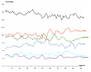
What about the cultural junkies? Let’s play with some lyrics, something that I’ve been really into of late. If we take every song that charted on the Billboard Top 40 between 1964 and 1989, do the same thing as speeches, what do we see?
Again, this invites closer reading. Because it’s such a larger chunk, I’ve separated it into 100 segments for easier close reading. Why were people so angry at point 60 – in 1980? The happiest moment in terms of this analysis comes around 1973/74, a bit counterintuitive. And the most love comes during the late 1970s with the Disco era. It’s kind of fun.
More work remains to be done to make this a rigorous historical tool. But for now, we certainly have a tool that invites opportunities for close reading, reflections on the emotional content of the past, and questions about how we can apply cutting-edge data mining research to the wide arrays of historical information increasingly becoming available.
Ian Milligan, a co-editor of ActiveHistory.ca, is currently a SSHRC Postdoctoral Fellow with the Department of History at Western University. He will be joining the University of Waterloo’s Department of History in August.


After some interest in the suite of tools, I’ve written a very quick step-by-step guide to install this on your own system. I’m not a technical writer by any stretch of the imagination, but I’ve tried to make this as accessible as possible.
http://ianmilligan.ca/2012/07/09/using-seasrs-workbench-to-explore-the-past-part-three-install-guide-for-newer-users/
Don’t hesitate to contact me with any questions, my e-mail address is on my website.